It’s Monday morning, and I’m editing one book and writing another. Blog post, you ask? Er. Ah, wait. I have one here in the hopper, a guest post by up-and-coming indie fantasy author, C.J. Brightley. She’s going to talk about how she found affordable cover art for her novel, The King’s Sword. If this is something you need to do yourself soon, please give her article a read!
Choosing Cover Art for Your Indie Book by CJ Brightley
One of the great things about indie publishing is that you retain so much creative control. And one of the terrible things about indie publishing is that you retain so much creative control! Choosing cover art can be a nerve-wracking experience.
 A few steps can help make the process a little less painful.
First, consider the message of your book. If you’re writing a fiction book, you may not have a “message” the way a nonfiction book might, but you do have a feeling, an emotion, or an overall atmosphere in mind. Think about the genre of your book and genre conventions (although they’re not rules!) for covers. Consider the target audience of your book and their preferences and expectations. Consider your writing style.
The cover is the first thing potential readers see. It’s a chance for you to set the reader’s expectations for your book. If you’ve written a funny chick lit novel, then your cover should have the same flavor as your book – funny, light, maybe a graphic illustration style. If you’ve written a dark urban fantasy, your cover will be completely different – different colors, different typefaces, and a different overall look.
Genre conventions for covers are useful because readers are familiar with them… fantasy novels look different than chick lit which look different than crime thrillers. Sometimes, for the sake of marketing, covers are put on traditionally published books that the author feels don’t represent their work at all… but they conform to certain genre expectations. It’s up to the marketing department rather than the author, even if the cover ends up misrepresenting the book! If you’ve written a fantasy novel but it’s not set in a pseudo-European medieval world, and you don’t have dragons, knights, orcs, or elves, as an indie author you have the freedom to choose a cover that more accurately represents your book, rather than a “stereotypical fantasy book” cover. But don’t forsake genre conventions completely – readers rely on those general styles to let them know whether your book is something they might want to read.
Second, consider the thumbnail image. If you’re self-publishing, chances are you’re focused more on ebooks than print publishing. Your cover art needs to be eye-catching and effective even when reduced to a tiny thumbnail image on Amazon, B&N, or other major website. That doesn’t mean you can’t have detail and depth to your cover, but it does mean that the design needs to effectively convey your message even in a small format. Consider the fonts used… will your name disappear when the cover is viewed as a thumbnail? Is the title hard to read?
These considerations are still important if you’re publishing in print. But if your primary focus is ebooks, the thumbnail image is critical!
Third, consider whether your book is part of a series. If so, consider having a common look or at least a common element among the covers in the same series. Even if you’ve only written the first book, it’s useful to know you’re preparing for a series when you work out a cover design.
Fourth, think about who will actually make your cover. If you’re experienced in graphic design, you might do it yourself. If you’re not, consider having a professional do it. There are any number of ways you can have a cover professionally made. If you know a talented artist, that’s one option. You can go to a freelance website, where you can peruse dozens or hundreds of portfolios and choose a designer. You can also work with a local designer. Even if you make your cover yourself, you want it to look professionally done – many readers are a little cautious about self-published authors, especially as the price approaches that of traditionally published books. That doesn’t mean they won’t purchase an indie book, but a great cover helps convey that you cared enough about your writing to give it that extra bit of polish both on the outside and on the inside of the cover.
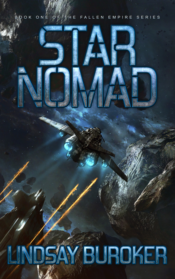
Lindsay’s Emperor’s Edge novels are a great example of covers done well. The covers are consistent across the series, so you know immediately that the books go together. They also convey the general flavor of the books. There’s a fantasy flair, but the look is more down-to-earth than many of the old-school fantasy covers you might see with dragons and glowing magic swords. The covers are graphic enough to catch the eye in small format, but detailed enough that they also look good when viewed larger. The covers are unique, but they’re identifiably “fantasy” so potential readers perusing Amazon can tell whether they might be interested.
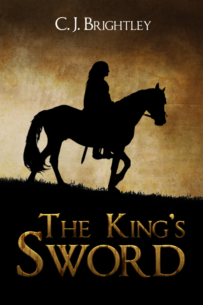
For my book The King’s Sword, I used the website 99designs.com to host a design contest. I love the cover, and I will continue to work with this designer in the future. It’s a fantasy, but it’s kind of a fantasy-lite – there’s no magic or anything particularly fantastical about the world, it’s just different. The title is a reference to the narrator, not a particular weapon, so having a figure on the cover was helpful (especially since the title does sound like a “standard fantasy”) to set the stage for a different type of story. Yet I’m not a fan of most cartoon-type fantasy covers with a Fabio figure holding a sword… they wouldn’t fit my book at all! I’m really happy with how the designer worked with me to create just the right look and feel.
If you choose to go this route, I have a few tips to make it work for you. The process is easy, but it does take some work to ensure you get a cover you love.
First, go through the steps above! Part of setting up the contest is writing a design brief that outlines what you want. Really think about your novel and the ideas you want to convey. Write out the general feel you’re looking for, perhaps a particular scene/character/item from the book you might want pictured, and the genre and any conventions you might want to conform to or deliberately break. The more detailed you can be, the better. Remember, the designers can’t read your mind and they haven’t read your book – the design brief is all they have to work with. It’s crucial to be respectful of the designers and their time investment… only the winning designer is paid, so the more information you provide at the beginning, the better. It’s better not to waste their time if they’re not the right fit.
Once the contest begins, designers have a relatively short period of time (in my case it was four days) to submit designs. Some clients kind of mentally check out during this time period and leave the designers to work in an information vacuum. Don’t do this! I got fantastic covers to choose from at the end mostly because I kept giving feedback during this design period. I found it was best to leave public feedback on most designs, especially at the beginning, because it provided clarification for every designer who was interested. I noted font styles that I liked or didn’t like, color schemes I liked, overall impressions, everything I could identify. The designers iterated on ideas and submitted updated designs based on the feedback I gave. Along the way, you can remove designers whose work you don’t like as much, or designers may drop out if they think their work isn’t to your taste.
By the time the final stage began, I had narrowed my covers down to about three or four options from three different designers (with additional minute variations of each design). I emailed friends and relatives who had read my book and got their opinions on which cover they preferred. All of the designs were fantastic – any of them would have made an excellent cover. However, we all agreed that the chosen cover represented my book the best.
I was very happy with the results of the design contest, and I subsequently worked with the same designer directly on the cover for the sequel, A Cold Wind, which will be published by the end of January 2013. If you don’t already have a designer in mind for your cover, a design contest is a great option both to get a cover for your book and to identify a designer you might like to work with in the future. However, keep in mind that the results you get largely depend you – if you don’t give your designers any feedback, you won’t get the iteration required for a refined, customized design. As with any other commissioned artwork, it depends on communication.
I hope the information above is helpful for anyone considering indie publishing. If you have any comments or questions, please feel free to contact me.
Bio:
C. J. Brightley published her first novel, The King’s Sword, in November 2012. The sequel, A Cold Wind, will be published in January 2013. Find her work online at www.cjbrightley.com, Amazon, and Goodreads. Follow her on Facebook.
Great information, C.J.! I agree that giving feedback to the designer is crucial. Their mind-reading abilities are limited. 😉
I heard about Streelight Graphics (Lindsay’s cover designers) on this blog, and I can’t say enough good things about them. I’m glad you had a positive experience with 99designs. But if you ever want to work with just one designer, I can’t recommend Streetlight highly enough!
Thanks for the recommendation! Now that I have one designer who understands the look that fits these books, I’m working with him directly. It’s just one option for finding the right person. Once you’ve found the right designer, don’t let him (or her!) get away!
I’m getting ready to publish my first book right now. My husband is a great horror artist, and since my book is horror, I figured he’ll be able to get it done right. He went to school for graphic design, so he also knows how to do the actual cover, not just the art.
We talked possible covers over, he made a few sketches and we narrowed it down to the one I liked best for the story.
He’s not done with it yet, but so far it looks great. Since he is doing it in watercolor and ink, I’m hoping it will stand out.
You’re fortunate to have such a talented artist in the family!
Great insights here. One thing to consider with the thumbnail image is that it will rarely appear anywhere without your name (or pen name) and title listed right next to it, so the readability of your title and author is not as important to catch the eye as it is with an actual book.
I know a lot of authors are enlarging the fonts to gross proportions so that their name and the title of their book is readable in thumbnail form, but I think this might be going the opposite direction as needed with the thumbnail format.
You’re right… I’ve also seen some like that. When I was looking at indie books, I saw a lot of extremely ornate script type fonts used… fonts that were difficult enough to read when you saw the cover blown up, much less in thumbnail size! You can definitely go too far in the other direction as well.
C.J., Great post! I told Lindsay I know someone specifically, who could really use this information and am passing it on.
I also think having a contest is a great way to find a designer, especially if you are doing a series of books. One question: Do you have potential designers read your novel before designing the cover or do you give them a synopsis of the story initially?
Thanks!
If I knew the designer and they were interested in reading the book, I’d definitely let them. But the website I used for the contest just has you submit a design brief, which is basically your explanation of what you want. I gave more of a synopsis of the overall feel, the narrator’s character, and overall themes of the book rather than specific plot points.
Having the control to implement the vision you like is one of the chief draws of indie. I know what I want my cover to look like, and indie gives me the freedom to do so.
Pingback: Contracting a Professionally Done eBook Cover | John Oleszkiewicz's Weblog
Hi John,
I just wanted to clarify that it was me who used 99designs.com, not Lindsay. The post was a guest post I wrote for Lindsay’s blog, and Lindsay has not used 99designs (as far as I know).
I agree that the $299 price tag is higher than most people can justify for short pieces (short stories, etc.). But if it helps, I used the contest to identify a designer whose work I liked. After the contest is over, you can use the site to work directly with the designer on future work.
The designer and I negotiated a lower rate for the cover for my second novel. The $299 fee includes a hefty percentage that goes to 99designs for hosting the contest. We essentially eliminated that percentage for the second cover, so the designer was paid the same amount (plus there was no uncertainty about whether he’d “win”), and I paid less, while knowing that the designer already understands my vision.
It works for novels, but for shorter pieces, the price is higher than most people can justify. I’m still undecided about covers for my short stories. Please post about your experience using eLance – that might be a good option as well.
Pingback: Writing Resources: 9 February 2013 | Gene Lempp ~ Writer
Love this post. Especially your insight into giving details in the design brief, and feedback along the way. As designers, we totally get that feeling of needing your cover to mesh with your precise vision of the story, and the best part of our job is when we create a cover that successfully reflects that vision. The things you’ve mentioned are the best help an author can give us to help create exactly what they want.
Thanks David!
Pingback: Guest Post on LindsayBuroker.com - C. J. Brightley
you could think you will be able to utilize an important
juice extractor yet somehow another juice extractor can merely partition the type of fresh fruit juices through your soluble
fiber for those of you discover how to contain
sucrose, breast milk, the rocks, accessories. With the an healthy morning drink food processor, verify that gives plenty of warmth particularly for computer memory, for convenient detoxing easy addressing.
A single juice machine created metal will beneficial when you finish many years of
usage.